
Mock-Up: VR Strategist UI Design

This is my first pass of the Strategist UI in the FIEA Capstone VR game The Draft. In this phase of the game you are meant to direct your units towrds the goal, as well as enemy units to initiate combat.
In this mock-up the player has a unit roster that they can select through, a section were they can see the name of the unit they have selected, as well as the amount of Special Ability that unit has, what team the player is on, how many units are in penalty, and a feedback section that shows the player what happened on the field with icons.

Ultimately, it was decided that there was too much unneeded information on the gauntlet.
In my second bass of the Strategist UI I took out the feedback section and the penalty section. To show that units are in penalty we will make the unit roster image of the unit go red while they are in penalty.

This is the approved UI Design, overlayed on the scene to show how it will look in context to the game.


After the UI Design was approved I began creating the gauntlet in Maya, texturing in Photoshop, and brought it into UE4.
My first pass of the model was made with planes, which I quickly realized looked jagged and sharp in the VR Space. Moving forward, I decided to give the model some thickness and do my texture work in Substance Painter.


Model Wireframes in Maya rendered with Renderman

Renders in Substance Painter.
This is the Model's final pass in UE4. The textures are being modified to match the color palette of each team and other elements are being implemented through blueprints.
This is the Texture's final pass in UE4. There are different states and parameters made for what team the player is on, which unit is selected, and what phase of the game the player is in.
The changes made to the design are due to user understandability and usefulness in the game. The special bar that used to be on the top right was replaced with game phase information because the special bar per unit information became irrelevant to the game an the game phase information became important to show the user. The other main change is the change between unit icons and just numbers. This change occurred because the bow unit is no longer in the game and the players had difficulty telling their units apart because they were the same icon, thus the units were labeled 1, 2, and 3.
Mock-Up: VR Jumbotron UI Design

For more information, I decided to add a Jumbotron to the arena. On the screens of the jumbotron there will be the feedback section, the game time, and all the screens will say TIME OUT when a time out is called.
This is the most recent pass of the Jumbotron UI for the VR game The Draft. Because the player has the ability to teleport the score can be seen on all of the Jumbotron screens.
We ended up taking out the feedback system to focus on telling the player which game phase they are in (Time Out, Strategist Phase, Battle Phase, and Strike Phase).
Winning screens for both teams have also been added, with the winning teams logo larger and the color of the winning team appearing on the panning rings.

The Jumbotron in scene - UE4
Mock-Up: VR Start Menu

This is the first pass of the Start Menu for the FIEA Capstone VR game The Draft. In the start menu the player will be able to choose the difficulty of the AI Opponent, choose they're height, travel to the Level Select Menu, read a how to play panel, test the sword and the bow, and exit the game.
Talking to my Lead designer, I will be iterating this design to have a more sleek futuristic design instead of an industrial design, including some animated movement of buttons, and I will be changing the How To Play section into a transport to a How To Area.

This is the second iteration of the Start Menu. For this table I focused on creating a sleek, more futuristic design, as well as a more detailed look at the tutorial table.
After talking to the Lead Designer I found that I needed to think of a different way to go "Back" to another tables/panels options, because the back lever wasn't going to work.

This is the final design for the Start Menu.
For this design I decided to combine the first start menu idea with the second one. The table space from the first one was important to the design and the sleek design and direction of the split up panels was also important.
To solve the fact that the tables couldn't go "Back" I made all of the panels accessible to the user and split the tutorial table into three different sides. There is also a table that holds both of the weapons so the player can pick them up and get used to them before the game.
I've included a small scale silhouette in the top corner to show the general scale of the player to the table.

This is the model of the Start Table, rendered in Maya with RenderMan.
This will be Rigged, Textured, and Animated by other members of my team. I will be doing the screen material.


These are the tutorial Panels I created using a custom made material function. Using this function I was able to easily create multiple panels, simply plugging in pictures and text into texture parameters

Camera Facing Unit Icons
I created a camera facing material with textures of the unit icons for the swordsmen and archers. There is an emissive mask so I can manipulate the icon silhouette and outline without the dark background. I have switch parameters to change the unit icon silhouette and color

We ended up shelving the archer unit for scope. We just had the swordsman icon silhouettes for awhile, but during playtesting players found it difficult to differentiate their different units.
Mock-Up: VR Level Select Menu

This is the first pass of the Level Select Menu for the FIEA Capstone VR game The Draft.
The player is meant to pull the lever on the VIP Ticket dispenser. A scan will begin and after it is complete the screen will welcome the player as a Strategist. The screen will then ask the player which team they want to choose and then which map they want to be in. After they are finished a ticket will dispense from the machine. Once the player has this ticket they will be transported to the game.


This is the second iteration, which has minor changes and simple color added for readability.
This is the models of the Level Select Menu, rendered in Maya with RenderMan.
Textured another member of my team. I will be doing the Screen materials and the Ticket material.
This is the Level Select Screen material. Multiple materials were made for the designers to assign the materials based on which button the player hits in game.
I created two Material Functions, one that creates the screen effect and one that accepts the font, with the appropriate parameters visible to the designers. This makes creating multiple screen material instances fast and easy.

These are the different Tickets in UE4 that will dispense depending on your options in the Level Select Booth.

This is the final look of the level that I designed. With two other artists that I lead we pushed my initial design into its final look.
This is the final look of the Start Menu/Level Select Menu.
Strike Prediction and Launch Path
In the FIEA Capston VR game The Draft the player has the opportunity to launch an enemy unit who has lost a battle into a penalty zone. This UI element is meant to show the player the predicted outcome if they swing from the direction they are point to and the correct applied force.
This Material Effect I created allows the designers to easily change different aspects of the path to create a Strike Launch Path that is visually different than the Strike Prediction Path.
This effect is placed on a spline to allow the designer to move the path along specified points.
The Parameters editable by the user for this material include: Color, Amount, Emissive Strength, Lines/Dots, and Speed.

Color:
-Color allows you to change the color of the path.
Amount:
-Amount allows you to change the amount of the dots or lines present on the spline as a whole and allows you to change their size based on their amount.
Emissive Strength:
-Emissive Strength allows you to change the glow amount of the color of the path.
Lines/Dots:
-Lines/Dots allows you to change the path to either lines, dots, or anything inbetween.
Speed:
-Speed allows you to change the speed of the path.
Game-play: Tea-cademy
This video shows the current state of Tea-cademy. The player begins on the start page and then is taken to the Tea Menu. There the player will see multiple tea sets and if teas are completed or locked. The player will be able to select the tea they wish to make and then be taken to a recipe card that explains the steps to make the tea. After reviewing the recipe the player can press the make it button, which will take them to the Tool Station and Tea Cup Station.
The Tool Station and Tea Cup Station show you the ingredients you have and allows you to prepare your tea. After the player has followed all of the steps, they are taken to the Steeping Phase. This is a mini-game where the player taps the ingredients entering the cup in order to steep the tea. As the player hits ingredients the steeping time decreases and the tea color changes.
Once the player has completed their tea the completion card appears, unlocking new information about the tea that was just prepared.
This game is designed to partner with clients to promote their products to players by creating a phone game community. Tea-cademy is programmed as a platform to allow fast modification and re-skinning for the needs of the client. On the completion page you'll see the Bigelow logo, which acts as a place holder for the future company we would promote.
For this game I was the Art Lead and the UI Lead. My job consisted in guiding those that provided art with guidelines for the style, as well as creating 2D ingredients, buttons, and backgrounds, and designing the UI and menu layouts.
Mock-Up : Tea-cademy
These mock-ups are for developing mobile game that teaches the player various tea recipes through mini-games, creating their own cup of digital tea.
These images show the basic layout of each of our screens. Here you see the plans for the Start Screen, the Tea Menu Screen, the Recipe Card Screen, the Ingredient Gathering Screen, the Cooking Station Screen, the Tea Cup Screen, the Steeping Screen, and the Completion Page Screen.
Further down the road we had to cut the Ingredient Gathering Screen due to programming scope.


Mock-Up: Oracle Menus


These are mock-ups for the various menus and dialogue for Oracle. Oracle is a Tactical RPG that takes place in Ancient Greece at the turn of the Millennium. (Learn more at www.oraclerpg.com )
Keeping this in mind, much of the UI is designed to inspire feelings of Ancient Greece. Inspiration was drawn from pottery.
UI: Oracle icons, status effects, boxes and frames
Map Icons


Shop Icons


Status Effects


Boxes and Frames


Map: Oracle


Mock-Up : VR Combat UI design

This is my first pass of the health bars for combat in a VR game. I was trying a few different styles to convey the information of the enemy health to the player that was both easy for the player to see and made sense in VR space.

This is my second pass of the combat bars in the FIEA Capstone VR game The Draft. In this mock-up I added a special power bar and began experimenting with floating bars in multiple locations as well as two designs in the 3D space.
HUD elements directly on the screen in VR is known to make players uncomfortable and makes information hard to read, so I narrowed my options down into UI in the 3D space.
Looking down to see information in a visor the player is wearing didn't pass on the basis of it being too distracting during combat and the visor designs didn't fit with the idea. In the end, the design I brought into the next phase of mock-ups was the bars located by the hands, a location easy for the player to see the information whenever they wanted it, without it being overly distracting or disorienting

This is my third pass of the combat bars in the FIEA Capstone VR game The Draft. In this mock-up I experimented with different locations the combat bars could be place.
I also added cracks that grow on the visor when the player loses health to further tell the player that they are being hit.
Discussions with the Design Lead narrowed down my choice to the Special Bar being perpendicular to the sword and the Health Bar being parallel to the arm.

After the Special Bar and Health Bar mock-ups were approved I created the bars in Maya. A plane is integrated into the bar, so the material effect can be applied.
After playtesting with the bar locations we have decided to have both bars parallel to the sword because the Special Bar in the way.
The Material Effect I created for the Special Bar and Health Bar animates the status bar UI based on a scalar parameter.
The Parameters editable by the user for this material include: Health/Special, and EmptyToFull.
Health/Special:
-Health/Special allows you to switch between the Health Status Bar and the Special Status Bar.
EmptyToFull:
-EmptyToFull allows you to change the bar from empty to full from the range 1-0

This is the next position I will be trying for the Special Bar and Health Bar. Another option is moving the Special Bar next to the Health Bar .
To show the enemy health there is a larger version of the Health Bar located on their sword holding arm, since the player will be focused on that arm and its movements.
This is the final iteration of the Special Bar and Health Bar positions. This adjustment was made because playtesters often felt that the Special Bar position was in the way when it was further up.
Both bars were then moved to be angled slightly inwards because of how the players tend to hold the controller. This positioning of the bars make it the easiest way for players to look at the information they need without getting in the way of combat.
Logo: Oracle
Superstar Vision


This is a Post Process Material that uses custom depth to allow objects to appear a solid color in the scene, as well as allow them to be seen through any mesh in the scene.
This Post Process is meant to show the player where the enemy units are at anytime.
I may be using my Custom Depth Post Process Material with my Visor View Post Process Material so I show what they would look like combined in the video above.
The Parameters editable by the user for this material include: SightColor, SightAlpha, and SuperstarToClearScene.
The top image is the scene without the Post Process
Material


SightColor:
-SightColor allows you to change the color of the objects that have the custom depth applied.
SightAlpha:
-SightAlpha allows you to change the opacity of the SightColor
SuperstarToClearScene:
-SuperstarToClearScene allows you to transition between the post process effect and the normal scene.

This left bottom image is the combination of the Custom Depth and the Visor View
Hollowed Animated In Game Icons

This is showing my basic idea of where the Icons and Buttons will be in the game. After sending it to the lead designer we decided to make the icon slightly smaller and the button twice as big.
The following is all of the animated icons I have created for the in game UI for the capstone game Hollowed. These are all set up for direct plugin to UE4 as flipbooks.
These Icons include animated button presses as well as the different moves you can use throughout the game.
This video shows off some of my animated icons integrated into the game.
The Draft Logos


In the FIEA Capston VR game there will be different teams you can choose from and different teams the AI opponent can be set to. To show the player different units I created unit logos for different teams. These logos are inspried by sport team logos.
This is the logo for The Draft, inspired by sports logos.
Hollowed Menus: Controller Menu

For the controller menu I painted a controller styled in the game's style with each power as the XBOX symbol. I'll be iterating this diagram, specifically the lines, so the labels can fit. I'll also be adding opacity to the controller so you can see the background behind the controller.
UI Orbs: Memory, Perspective, Questions
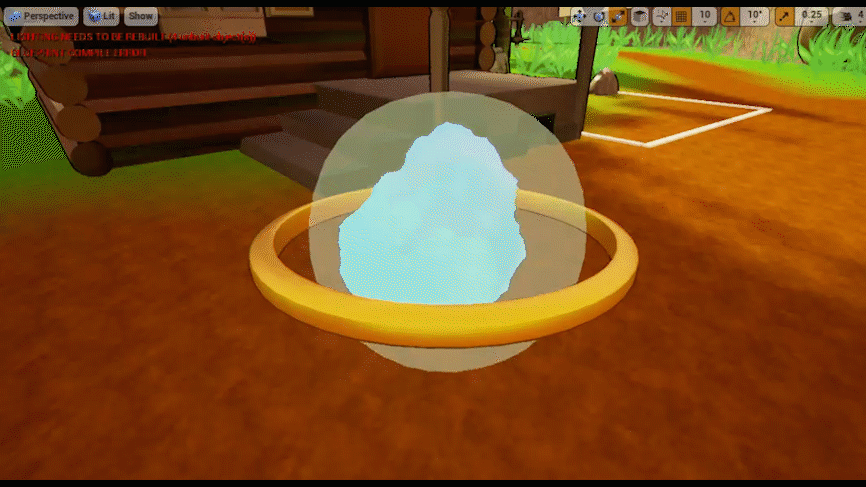

This is the first pass of the UI Orbs for the FIEA Gamelab VR game Why Did Baba Yaga Take My Brother? The idea behind this piece of UI was that there would be an orb that contained the memories of the characters in the game and the player would be able to grab the orb and press it to their visor to see the memory.
This game involved a Subject Matter Expert in teaching and recording empathy in children (the ultimate goal of the game) and she was also the client, in charge of the overall feel and look of the game.
Speaking with her, she wanted the ring to be replaced with a film strip and other objects that represented memory, perspective, and questions. She was also worried that the constant change of color was distracting
This was my final pass on the UI Orbs. I created different themed rings to represent memory, perspective, and questions, as well as created solid smokes that the designer's could easily change the color of with a parameter.
Why DId Baba Yaga Take My Brother? Logo


Iconograpic: Children's VR How To Play

For the FIEA Gamelab VR game Why Did Baba Yaga Take My Brother? I was tasked with creating the icons for the Iconography designed to show young children how to play the game.
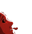
The first thing I did was make sure that the hand icon was always red, because the player hands in our game wore red gloves.
The character in the iconography is also a character that these orbs are used on in the game
The orbs were iterated on one final time and are drawn here to match the final look in game.


The three pages above are the iconography pages the designers implemented my icons into.
Cardlink VR Game: Card First Passes


First passes on card designs for a VR Card Game.
Tool: Project Management Tool


Photoshop Mock-Ups of what I want my Project Management Tool to look like

This is my first pass of my tool using PyQT Designer

This is the final look of what my Project Management Tool looks like.